
We have some BIG news to share! After more than twenty years, we have updated our look and logo! You will start to see our new look everywhere, like when we are out in public, on our website, and on social media. The new look, including new colors and fonts, updates and refreshes our brand and better matches where Milwaukee Riverkeeper is today and how we have grown since 1995. As the VOICE OF THE RIVER, we are so excited about our new look and logo.
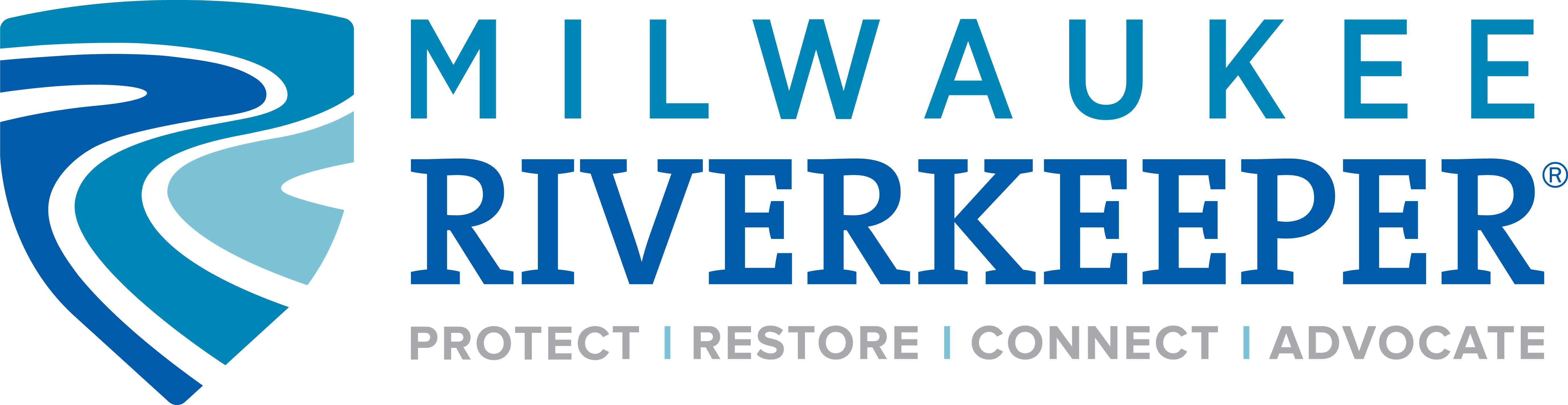
In our new logo, three flowing rivers are depicted within a bold shield representing how Milwaukee Riverkeeper staff and supporters, like YOU, help to protect the Milwaukee River Basin. The heroic interpretation was chosen because it illustrates our unique position as the only science-based advocacy organization working for swimmable, fishable rivers in the Milwaukee River Basin.
The shield clearly demonstrates what we do:
- PROTECT – This shield shape was chosen because it represents both defense & offense in battle – in our case we defend the health of our rivers and protect them for future generations. It embodies strength and empowerment.
- RESTORE – The three flowing lines represent the organic, spiritual meandering of our three free-flowing rivers (Milwaukee, Menomonee, and Kinnickinnic). Not contained or restricted, but restored and free.
- CONNECT – The varied colors & dimensions of the rivers reveal coming together of different peoples and communities for a unified and singular outcome – healthy rivers and eco-systems.
- ADVOCATE – The shield shape is representative of offense in battle – which is symbolic of our advocacy work.
We hope you like our new logo and new look. We worked hard to find the right fit for us and we are thankful for all of those who helped us get here, including Monarch Creative, our branding consultant, our dedicated board of directors and the expertise and guidance of the best Fundraising and Marketing Committee east and west of the Mississippi.